COUNTDOWN Research Uptake Team & the COUNTDOWN Consortium
As researchers, we all understand that presenting posters is part of our publishing journey and doorway to conference participation. But it is important to take time out and reflect on what makes for a good poster. As part of our 3rd Annual Partners’ Meeting, hosted in Yaoundé, Cameroon a side workshop was held on Friday, 31st March 2017, during which participants reflected on this issue.
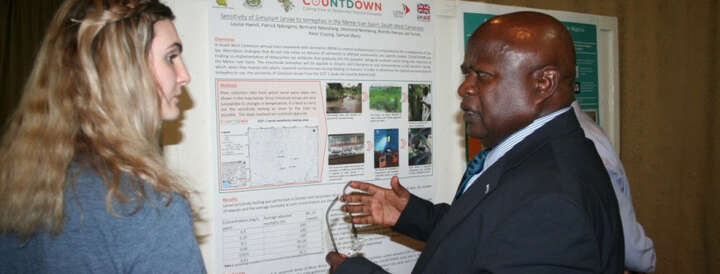
To begin the exercise, we had a poster walk and assessed all posters created by team members within the partner countries (Cameroon, Ghana, Liberia and Nigeria) that make-up our consortium. Discussions were had around what people liked and did not enjoy about the posters. What could have made the posters better? Responses to this question, provided these “hot tips” to creating an impactful poster, which we share below in case you find them insightful.


(Poster walk, part of poster writing session – Friday, 31st March 2017)
1) Attractive from a distance/captivating
First impressions make lasting impressions some say. It was identified that it is important for the poster to attract attention from afar. This means the images should be clearly visible and the colour coordination arresting.
2) Catchy Title
Appearances can pull the crowd and gives a good punch, but a captivating title keeps them. Ensure your title is concise, straight to the point and offers a clear message.
3) Poster Structure
We understand that posters vary depending on whether they are scientific or non-scientific. But one thing was unanimously agreed, the structure should be logical to put the policies, process and NTD programmes in context. This helps learning/generalisability across themes; whilst providing a better reading order.
Making the language and concepts easy to grasp across all the disciplines, helps the audience to understand your message. Avoid heavy use of text and keep the poster clean and less busy.
It also helps to reference your work clearly where appropriate in the same format. This should situate your body of work.
Emphasis was given to acknowledging the contributors involved in the work and their institutional affiliations.
4. Use of Images
We know that a picture speaks a thousand words and to ensure Neglected Tropical Diseases (in our context) are kept alive, we use photos from the field.
Not forgetting our ethical duties to ensure the photos are appropriately sources, with consent granted and the authors acknowledged to avoid copyright infringements. (Reference to be included)
5) Branding
It is advisable to adhere to the branding of your institution and/or the project you are working on. Ensure the logos are well-placed and in some cases, funders like to see their logos visibly displayed. Do check with them on their preferences. For COUNTDOWN, we coordinate the branding of our posters through use of colours clearly linked to our materials and project. This presents the uniformity in brand identification for our work in various publications, meetings and conferences.
We always welcome more ideas to improve those outlined above as these are not prescriptive but suggestive.
Please feel free to join the conversation in the comment section or on our social media page via Twitter @NTDCOUNTDOWN.
